Poetcore or Dark Academia? How to Choose a Mood for a Junk Journal
Quick answer: Poetcore and dark academia can share parchment, books and deep blue, but the page feels different depending on whether the story needs softness or structure.
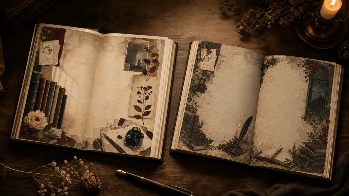
Editorial note: This guide is based on the current ScrapBujo catalog and practical craft-planning principles. The featured image is an AI-assisted editorial mockup built from the actual collection previews shown below; it is not presented as a photograph of a completed print test.
Who this helps
Use this comparison before buying or printing when two collections look beautiful but you are unsure which one will support the story you actually want to tell.
What to gather before you start
- One photograph, quote or memory to anchor the page
- Two or three supplied paper previews
- A neutral pen and one texture such as ribbon or vellum
- A scrap sheet for testing the visual hierarchy
- A folder that keeps the two collections separate
A practical plan
Name the emotional temperature
Write three words for the memory before choosing paper. Soft, hopeful and reflective often point toward poetcore; focused, archival and mysterious may suit dark academia. This is a planning aid, not a fixed rule.
Choose the background by quietness
Use the paper with the most open space behind the photograph or writing. Save the busiest supplied page for a smaller panel, pocket or detail.
Decide whether the page needs a frame
Dark academia often benefits from a defined border or structured block. Poetcore can leave more air around a line of writing. Let the content determine the frame.
Repeat one anchor color
Choose one color that appears in both the image and the paper. Repetition creates cohesion without needing to add more embellishments.
Build a two-layer test
Place a photo or blank rectangle over two paper options before trimming. If the subject disappears, the paper is not wrong; it may simply be a better layer underneath or on a neighboring page.
Write before decorating
Draft the sentence first. It will tell you whether you need a pale writing card, a darker ink, more space or a different paper entirely.
Common mistake to avoid
The common mistake is choosing a mood label before choosing the story. Use poetcore and dark academia as useful shorthand, then let the photograph and writing make the final decision.
Questions to answer before buying
- What does the memory need from the page?
- Which supplied paper leaves space for the words?
- Is the dark area a frame or an obstacle?
- Can the same palette support the next page?
Make the first session small
Start with one finished surface, not the entire project. For this guide, begin with one photograph, quote or memory to anchor the page and one clear memory or use case. A small first session makes it easier to notice whether the paper, scale and writing space are doing their jobs before you spend time trimming every piece.
Run a useful quality check
After one sample or one assembled page, check four things: the main subject is visible, the writing can be read at normal size, the edges are not accidentally cropped and the page still makes sense without an explanation from the maker. If the project is printed, compare the result with the screen and record the printer, paper and scale setting. Colors can vary with screen, printer, ink, paper and print settings.
Keep a project note for next time
- Record the collection name and exact format used.
- Note which paper became the background and which became the accent.
- Write down the size of the photograph, card or tag that fit comfortably.
- Save one sentence describing what you would change on the next page.
- Keep the source link with the finished project so file details and current offers can be checked later.
Mini FAQ
What does the memory need from the page?
Answer it before you buy or print. The collection page and the exact Etsy listing should confirm the file count, size, delivery method and current eligibility; a styled mockup can show a possible arrangement but cannot confirm those commercial details.
What if the first layout feels too busy?
Remove one layer before adding another. Keep the focal photograph, the most useful writing area and one paper surface; store the remaining pieces for the facing page or a later project.
What if the project changes halfway through?
That is normal. Keep the original source files and note the change rather than forcing the page to match the first idea. A documented adjustment is more useful than a polished page whose process cannot be repeated. Add the date, format and reason for the change so another person can understand the decision later.
Collection previews used in this guide
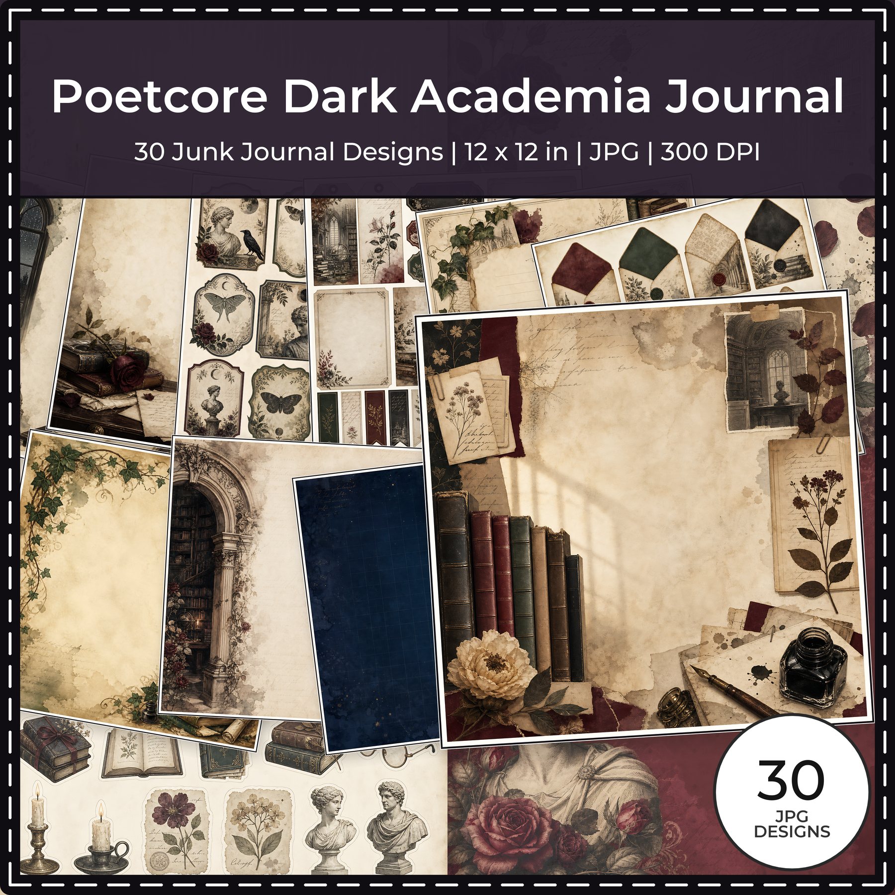
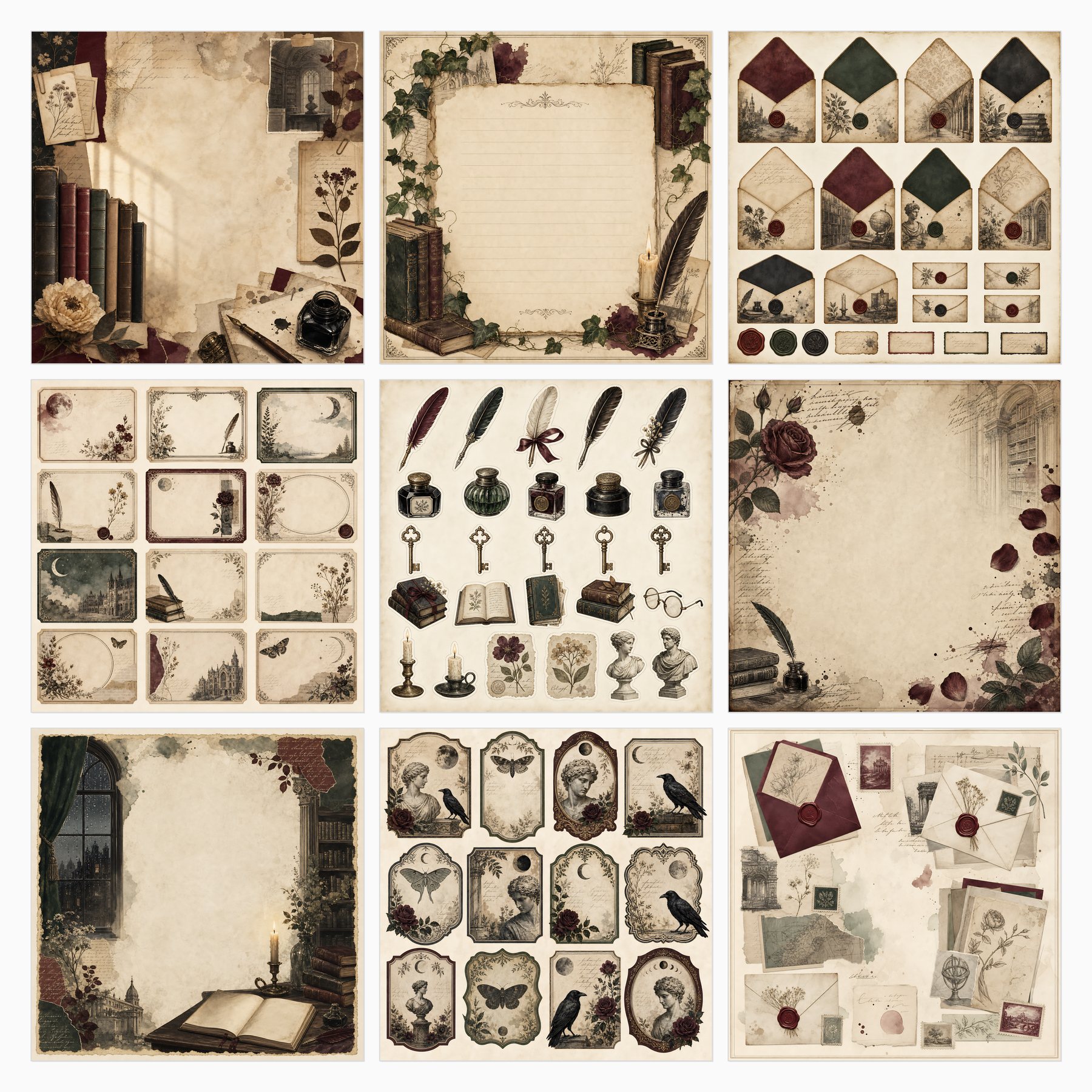
These are current ScrapBujo collection previews, not substitute artwork. They show the paper surfaces and formats discussed below.
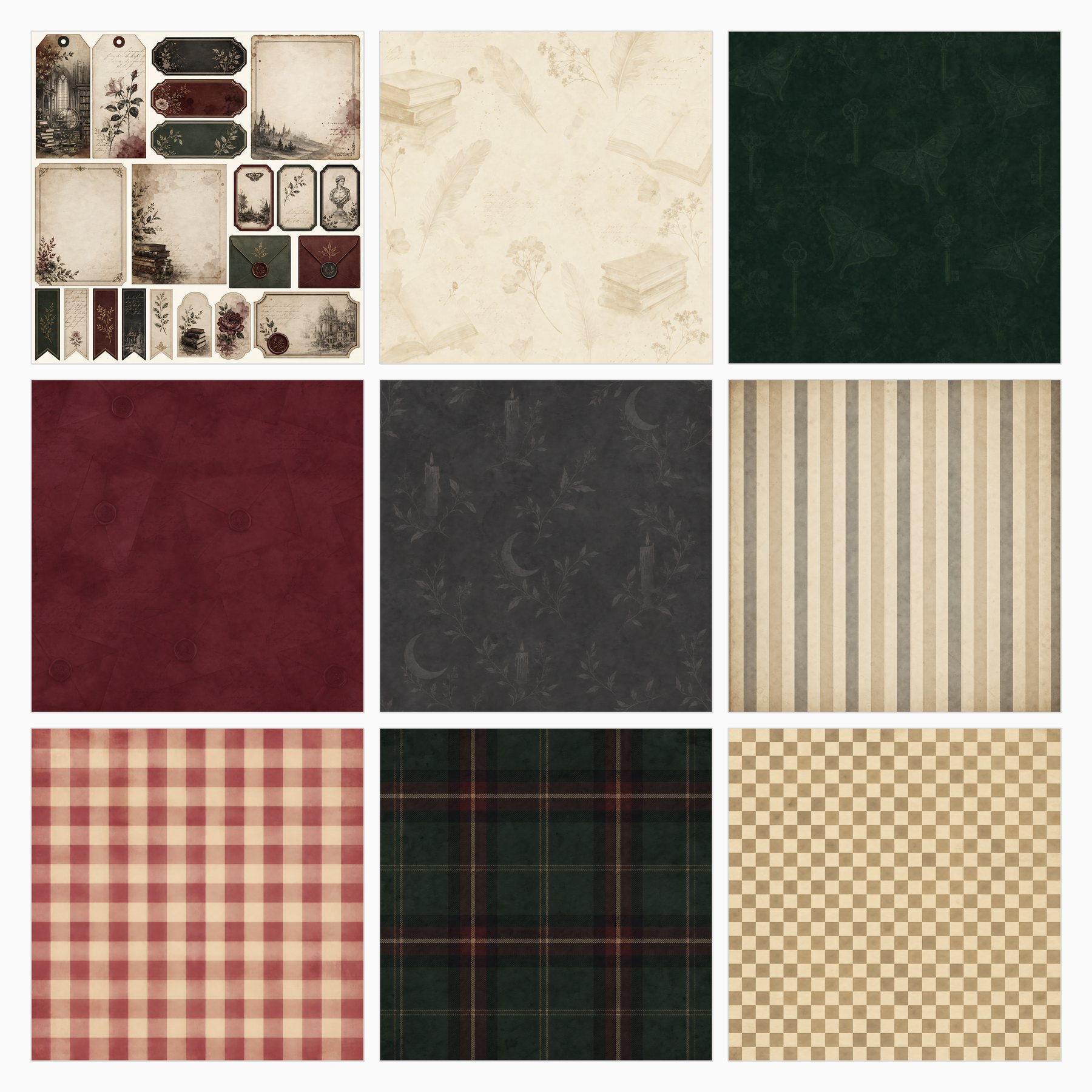
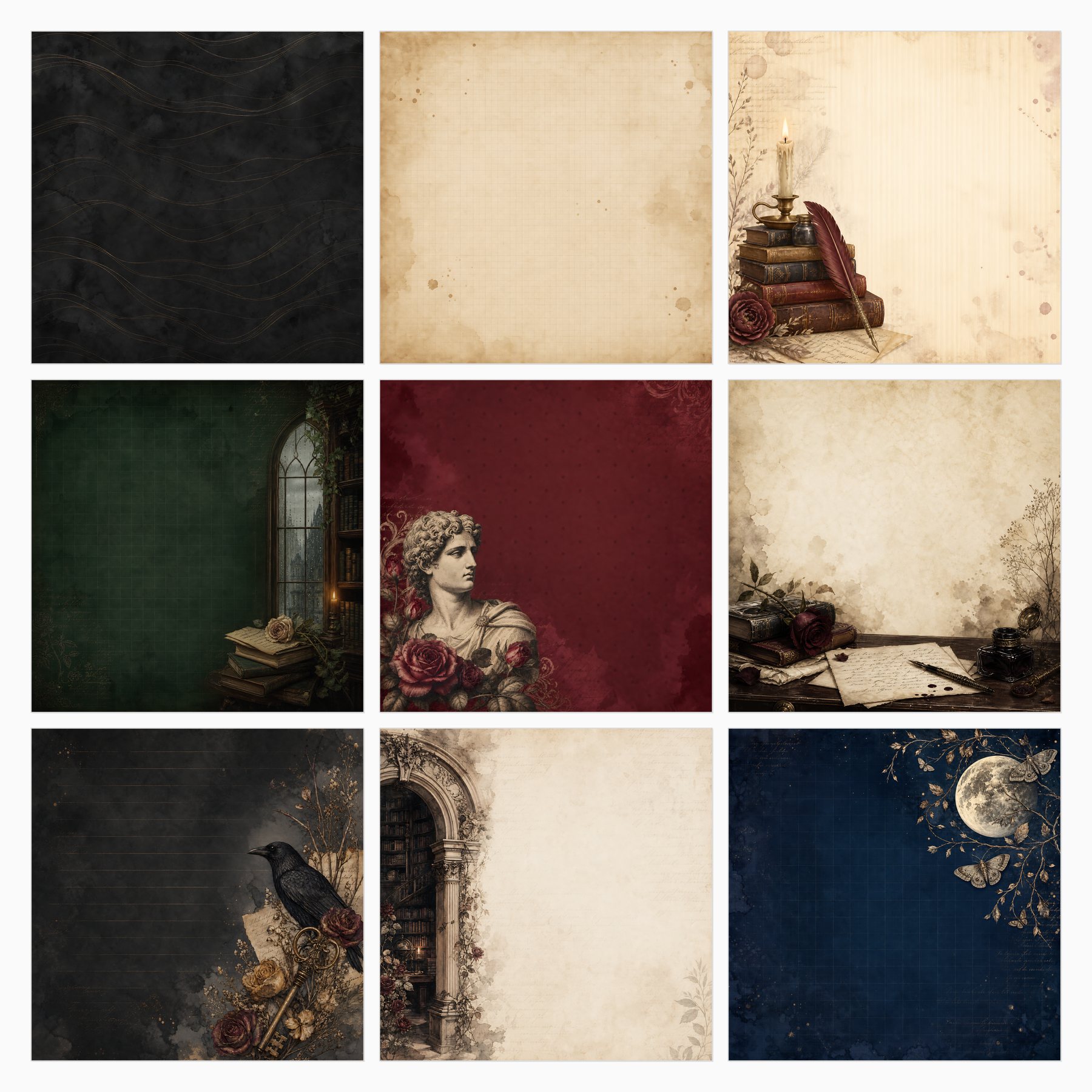
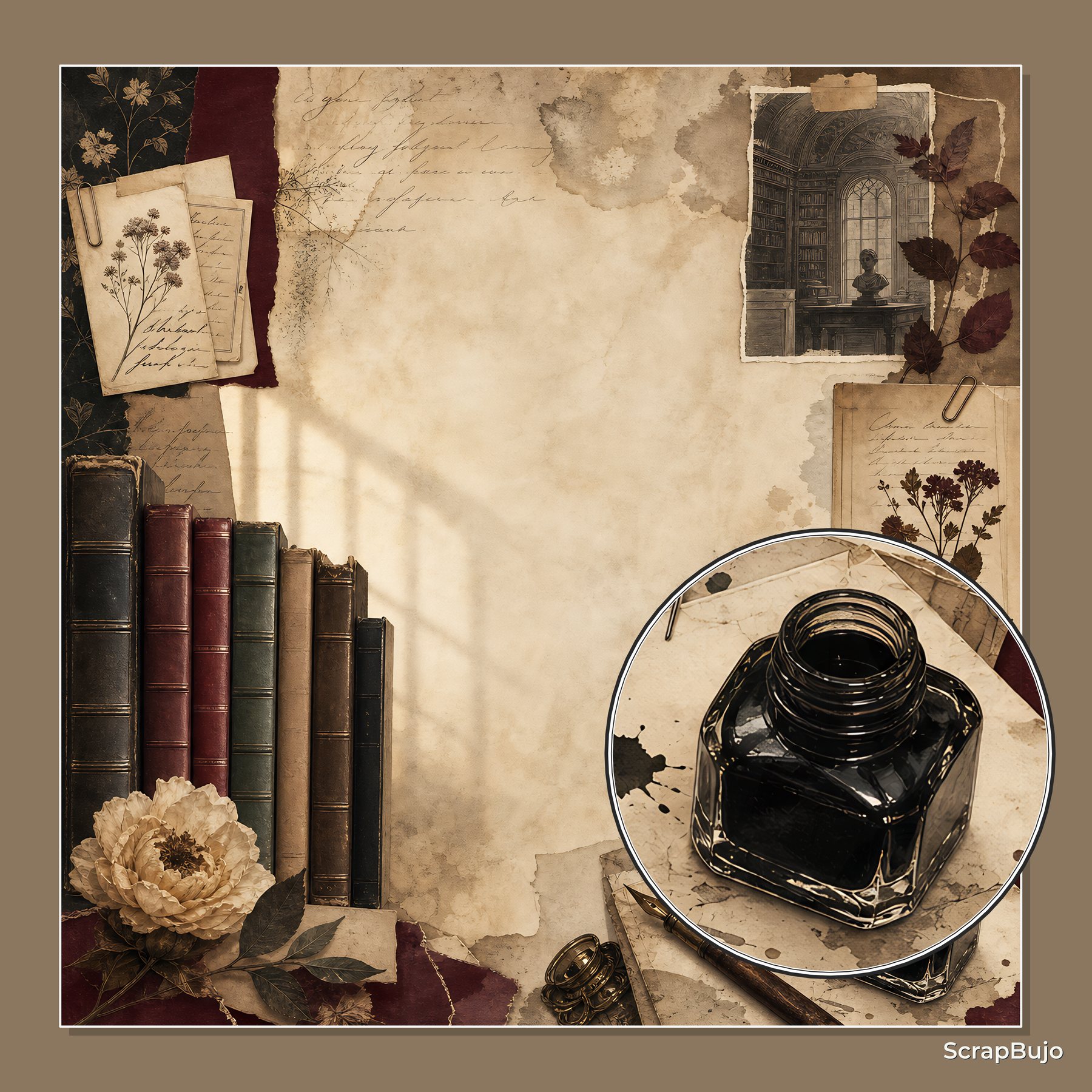
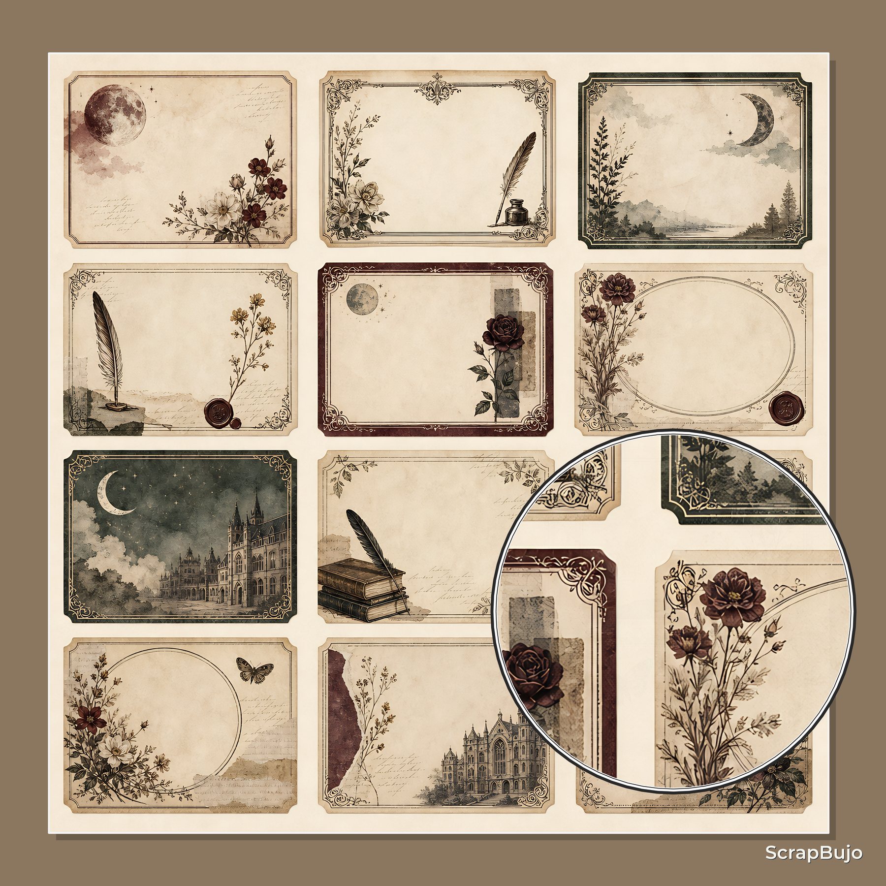
Related free samples: Browse free printable samples before choosing a full pack.
Explore ScrapBujo digital collections
Explore the related digital collection
Review the collection previews and current file details before choosing a format.

12×12 in 300 DPI Digital download
Digital Scrapbook Papers
Poetcore Dark Academia Journal
Explore 30 coordinated digital scrapbook papers from the ScrapBujo Poetcore Dark Academia Journal…
Each product page identifies its checkout, current price, and digital delivery details.