
7 Cool Blue Scrapbook Palettes That Still Feel Warm

Blue scrapbook paper can feel welcoming when it is paired with the right neutral, texture and small warm accent. These seven palettes keep the calm quality of blue without making family pages look cold or distant.
Let blue cover most of the page, choose a soft neutral for breathing room and use one warm accent in a much smaller amount. Natural paper texture and cream photo borders usually soften the result better than adding more patterns.
At a glance
- Powder blue, cream and honey: Use powder blue for the background, cream around photographs and honey yellow only for dates or tiny flower centers.
- Denim, oatmeal and rust: Pair a worn denim blue with oatmeal paper and one rust label.
- Dusty aqua, blush and warm gray: Keep blush to one narrow layer beneath the photograph.
Before you start
Pull one photograph before choosing colors and identify its warmest small detail: skin tone, wood, sunlight, clothing or sand. Match that detail with an accent. Print a 2-inch swatch on the paper you plan to use because screens emit light while paper reflects it.
Try three paper swatches beside your photo
- Choose the photograph first, then pick three colors to try with paper scraps. Draw three small swatches or cut three pieces from papers you already have.
- Label them “background,” “quiet mat or writing area,” and “small warm accent.” Let the background frame the photo, keep the quiet color open for notes, and use the accent to echo one small detail.
- Set the swatches beside the photo and step back. If the colors compete with the image or make the page feel busy, swap one swatch and compare again.
- Before gluing, write a few words on the quiet-color piece. Check that your handwriting is easy to read and that there is enough room for the note.
For example, a photo of a denim jacket could suggest denim blue for the page, cream to frame the photo, and rust for one small label. Treat this as a design plan; your photo and paper scraps will guide your choices.
The seven combinations below are layout ideas; they do not guarantee that every named color appears in the Watercolor Blue Breeze product.
1. Powder blue, cream and honey
Use powder blue for the background, cream around photographs and honey yellow only for dates or tiny flower centers. The restrained yellow makes the whole page feel sunlit.
Build the composition in three passes: place the largest photograph or writing card first, add one medium supporting shape, then stop after a few small accents. This order protects the focal point and makes it easier to remove decoration before adhesive turns an experiment into a permanent decision.
2. Denim, oatmeal and rust
Pair a worn denim blue with oatmeal paper and one rust label. It suits everyday family photographs, jeans and outdoor autumn light.
Keep dates, names and the main sentence together in one clear reading zone. Decorative labels should support that information rather than split it across the page. Write a rough caption on scrap paper first so the final space matches what you genuinely want to remember.

3. Dusty aqua, blush and warm gray
Keep blush to one narrow layer beneath the photograph. Warm gray journaling cards prevent the combination from becoming overly sweet.
Repeat one color or shape from an earlier spread to make the album feel connected. Repetition does not require identical pages: a small leaf, rounded corner or narrow border can carry the visual rhythm while photographs and stories remain different.
4. Navy, ivory and brass
Use navy in broad shapes, ivory for text and a brass-colored line or fastener as the accent. Strong contrast gives formal pages warmth and structure.
If you print the elements, make one inexpensive test on the exact paper before producing multiples. Check small text, shadow detail and cut lines in normal room light. Keep the original proportions and avoid enlarging a low-resolution preview beyond the size it can support.

5. Cornflower, kraft and tomato red
Kraft paper grounds lively cornflower blue, while a tiny red tab creates energy. Repeat red only once to protect the calm palette.
Photograph the loose arrangement before gluing it. The quick reference helps when pieces shift and gives you a record of alternatives. It also makes it easier to move the entire idea into a different album size without rebuilding from memory.
6. Teal, parchment and peach
Choose muted teal rather than saturated turquoise. Parchment softens the contrast and peach works well near portraits without dominating them.

7. Slate blue, linen and terracotta
This quiet palette suits heritage photographs and travel pages. Use terracotta for one title word or stitched border, not a full background.


What to avoid
Keep the photo, colors and handwriting in balance: if several patterns or accents compete for attention, remove one and leave more open space. Use a calm, lighter area for journaling, and write at a size that is comfortable to read. Check that the photo remains the focal point and that its caption is easy to find.
How to start today
Choose one idea from this guide, one photograph or writing prompt, and two coordinating papers. Make a loose arrangement without adhesive, write the factual caption, then decide whether the page needs anything else. One completed, readable page is a better beginning than twelve elaborate bases waiting for the “perfect” memory.
Try the style before choosing the full collection
Open free coastal and blue printable samples to examine a free ScrapBujo sample first. The sample page explains the included files and usage terms and links back to the matching collection when one is available.
Check size before you print
Use the 300 DPI to pixels calculator to confirm the pixel dimensions for your finished size. For full-size square layouts, the 12×12 scrapbook printing guide explains wide-format printers, print services, paper support and true-size settings.
See the quick visual Story for this guide.
Explore Watercolor Blue Breeze Vintage Botanical Scrapbook Paper Pack (Digital Download) on ScrapBujo for the coordinated previews and file details.
View this digital collection on Etsy. This is a digital download; no physical paper is shipped.
Source note: The collection facts and preview images in this article were checked against the ScrapBujo catalog on 2026-08-14. The examples are product previews; they do not replace a print test.
Explore ScrapBujo digital collections
Explore the related digital collection
Review the collection previews and current file details before choosing a format.
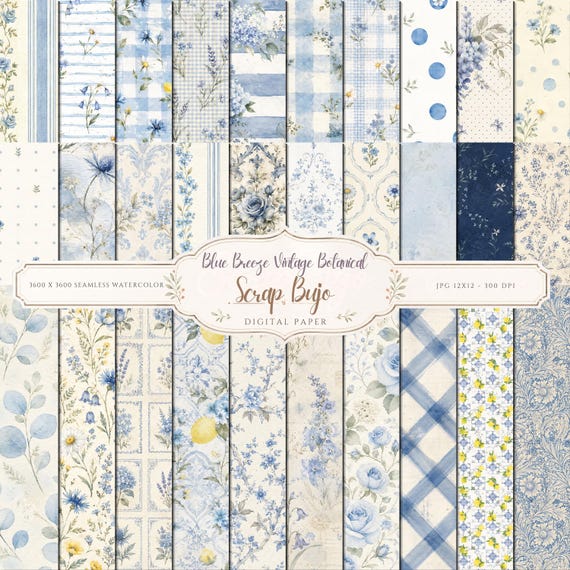
12×12 in 300 DPI Digital download
Coastal & Summer · Coloring & Printables
Watercolor Blue Breeze Vintage Botanical Scrapbook Paper Pack
Bring a soft vintage touch to your creative projects with this Blue Breeze…
Each product page identifies its checkout, current price, and digital delivery details.